My teammate and I created a rebrand for a Patisserie that fuses asian flavors with classic french techniques and Loves Pink.

The Client
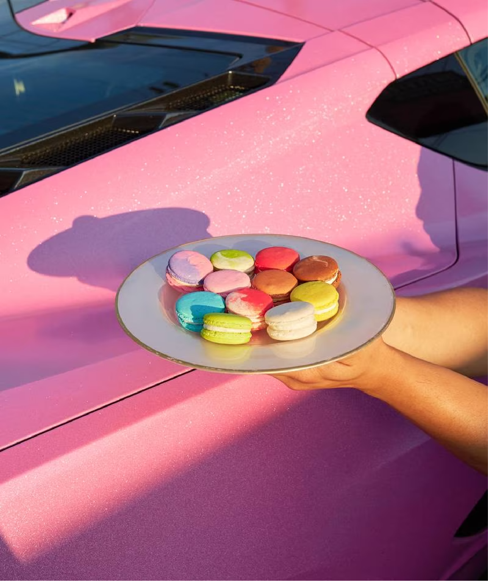
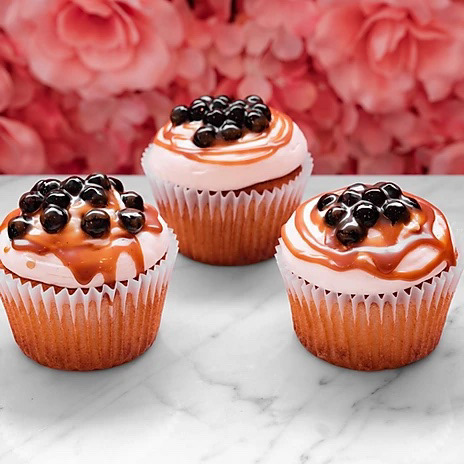
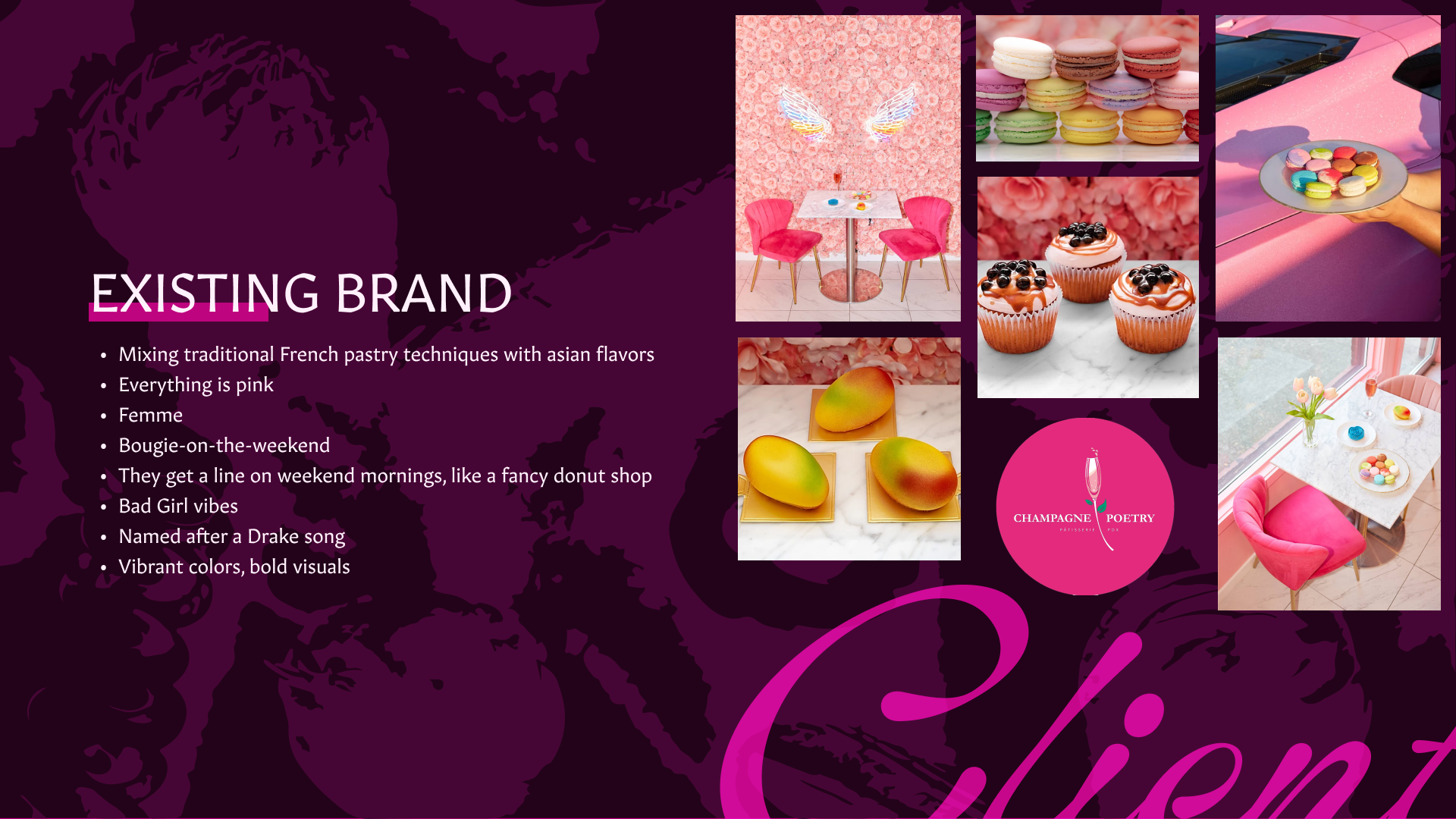
Champagne Poetry is a French Asian fusion patisserie located on SE Hawthorne Boulevard in Portland, Oregon. Founder Dan Bian blends classic French pastry techniques with asian-inspired fruit and floral flavors to create unique and delicious pastry creations. Champagne poetry also offers champagne and wines that pair with their pastries... oh, and everything in the patisserie is pink.
Existing Branding
We analyzed CP's existing branding to see what was working and what wasn't. We visited the patisserie, read write-ups on food blogs, checked out the website and IG, and came up with some brand attributes that characterize their unique voice.
What Was and Wasn't Working
Champagne poetry stands out against the minimalist landscape of elevated french patisseries with their bold flavors and unique creations, and they have a unique voice that's giving a slightly sassy, definitely bougie femininity. This voice is expressed well in certain staged photo shoots, and by the combination of neon and floral elements, but the actual graphic branding elements are disconnected from each other and uninspired.
Goals
We aimed to create a distinct and clear visual language that reflects the kind of consideration-of-every-detail that makes the pastries so amazing.
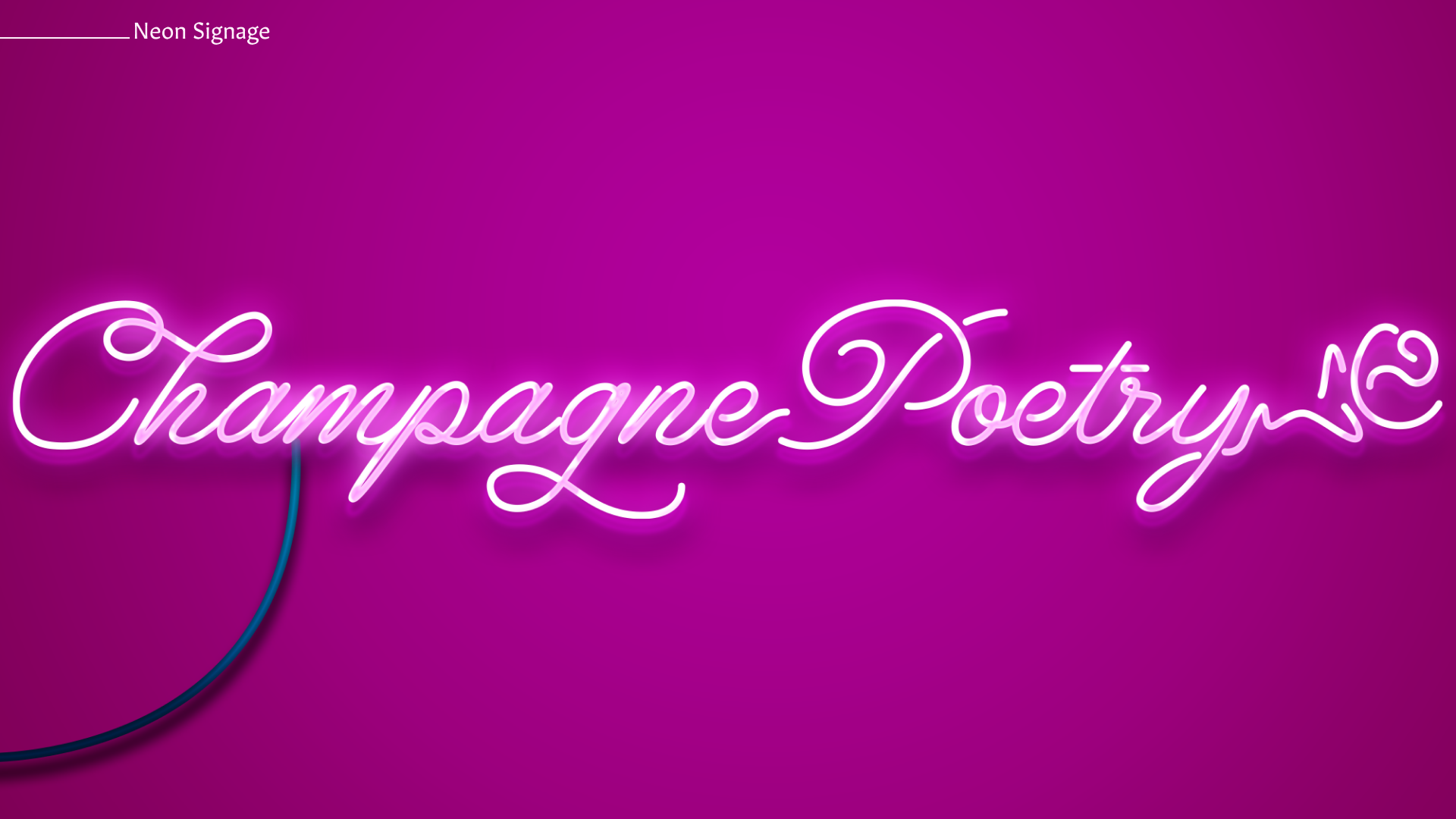
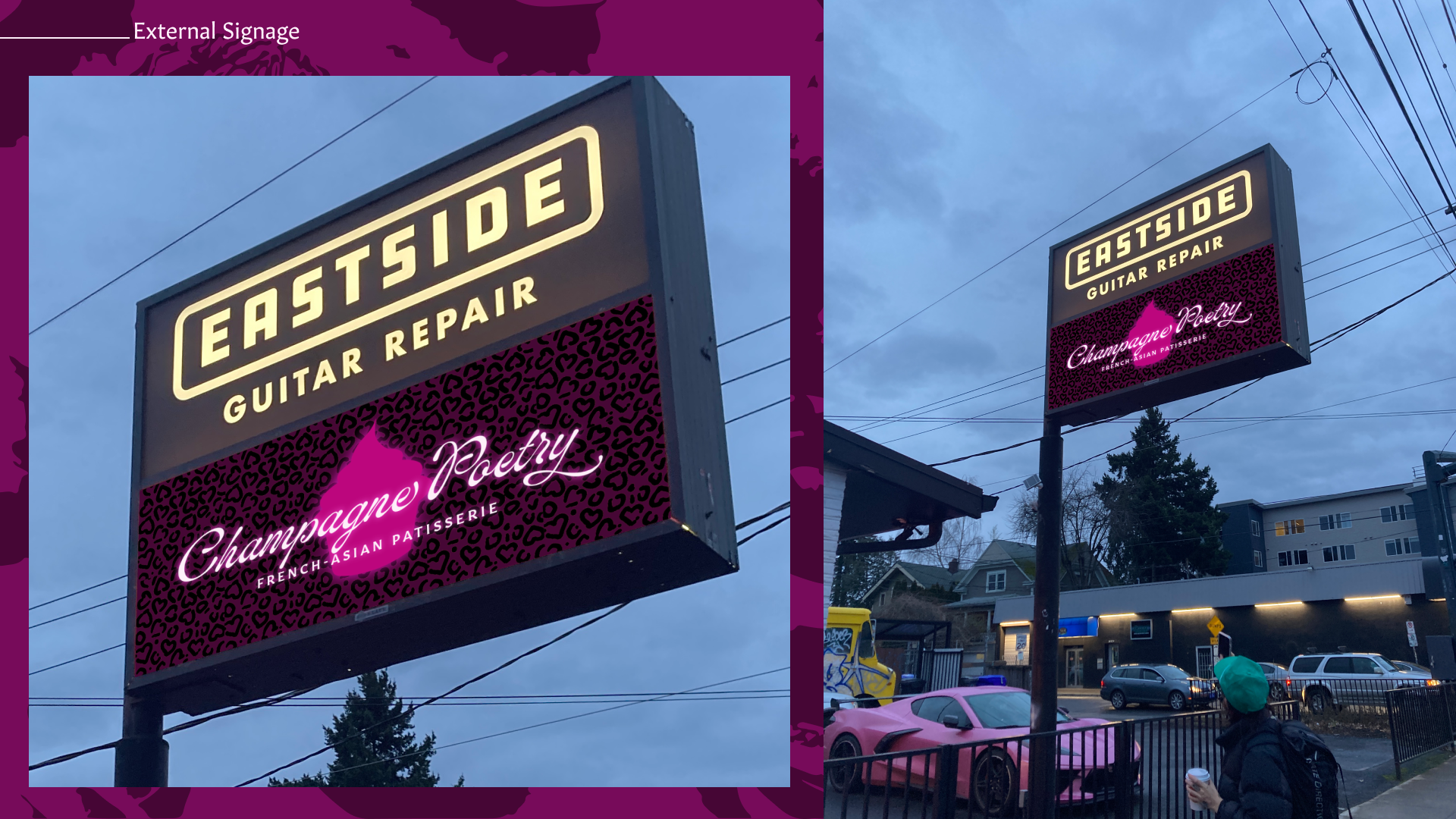
We needed a wordmark that works better at scale, and new outdoor signage that communicates the product offering explicitly as well as the vibe.
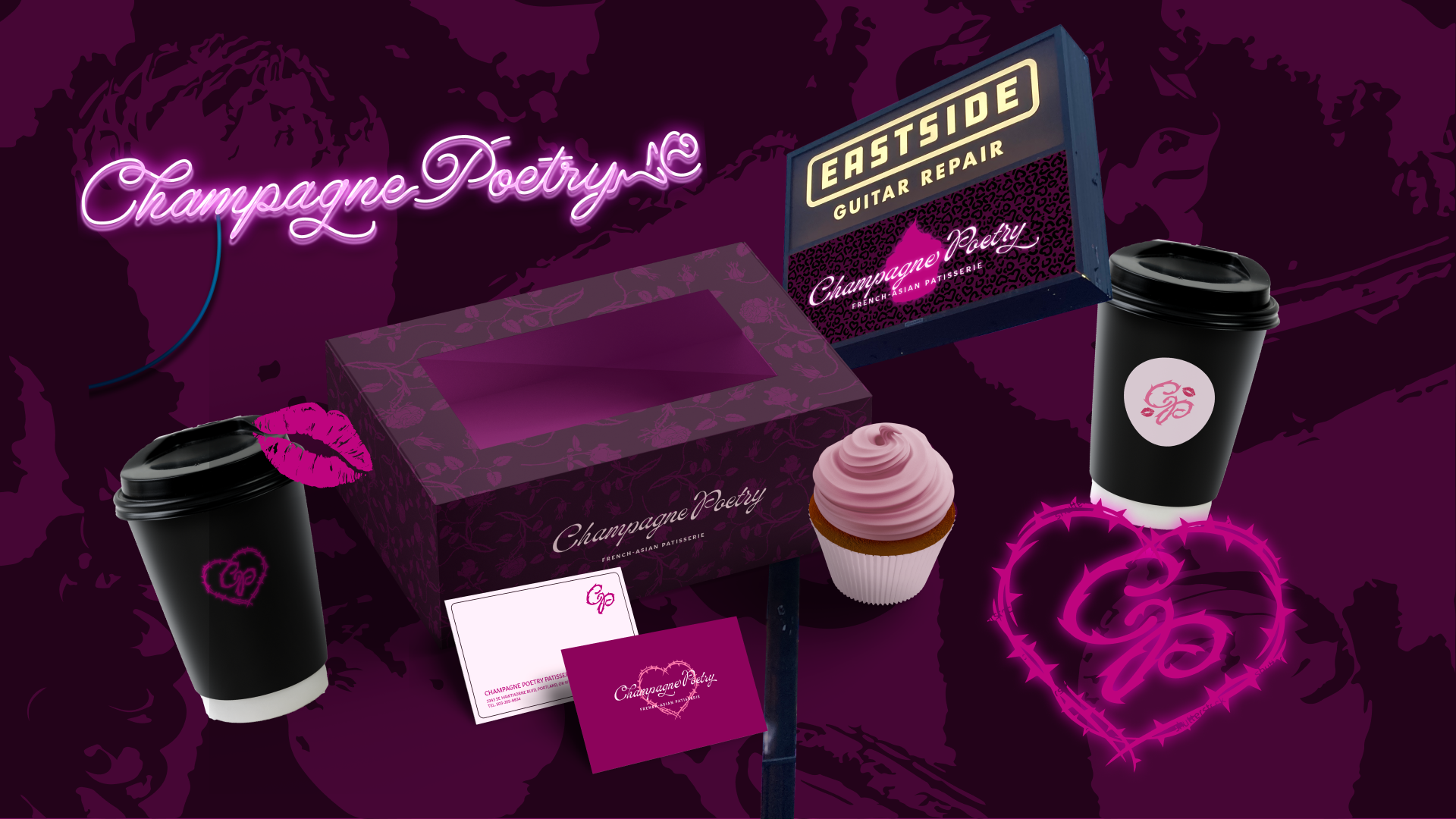
The New Champagne Poetry
our vision is an edgier take on the bougie femme vibes we were getting from Champagne Poetry. We wanted to balance the elegance of elevated french pastries with bad girl vibes. This is the morning after girls night out.
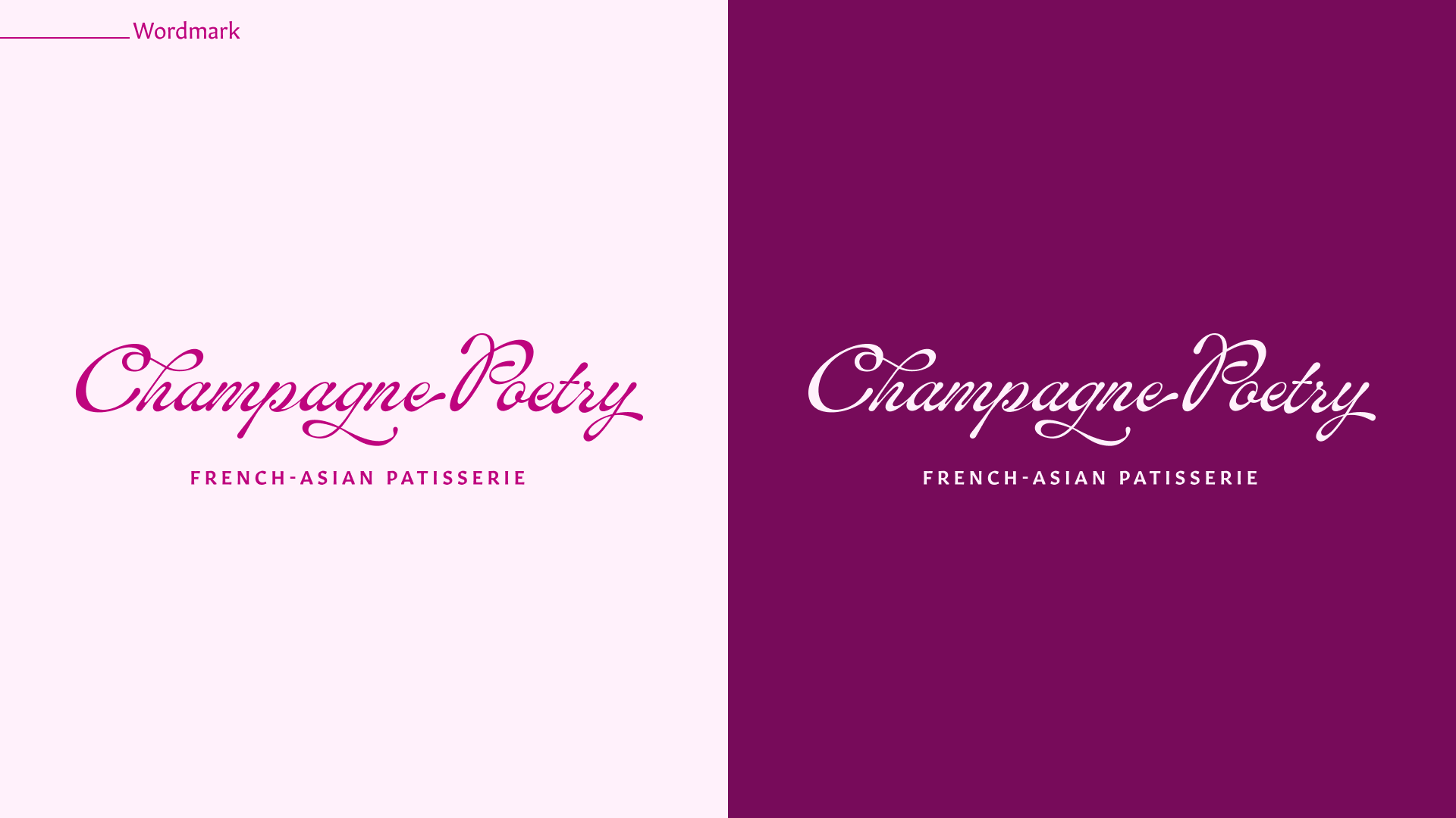
Wordmark
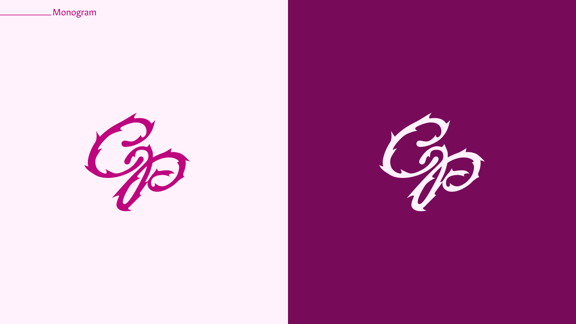
Monogram
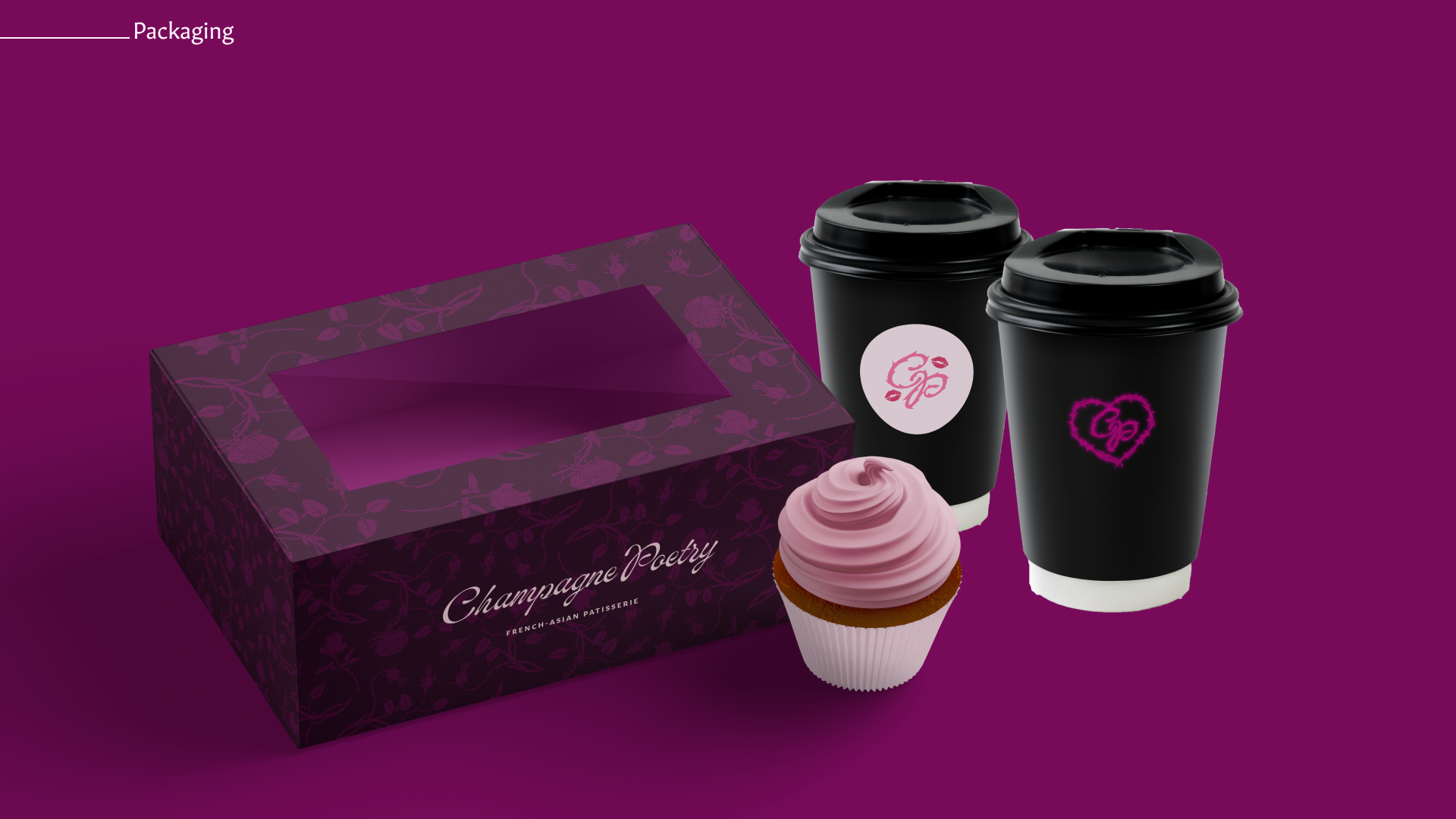
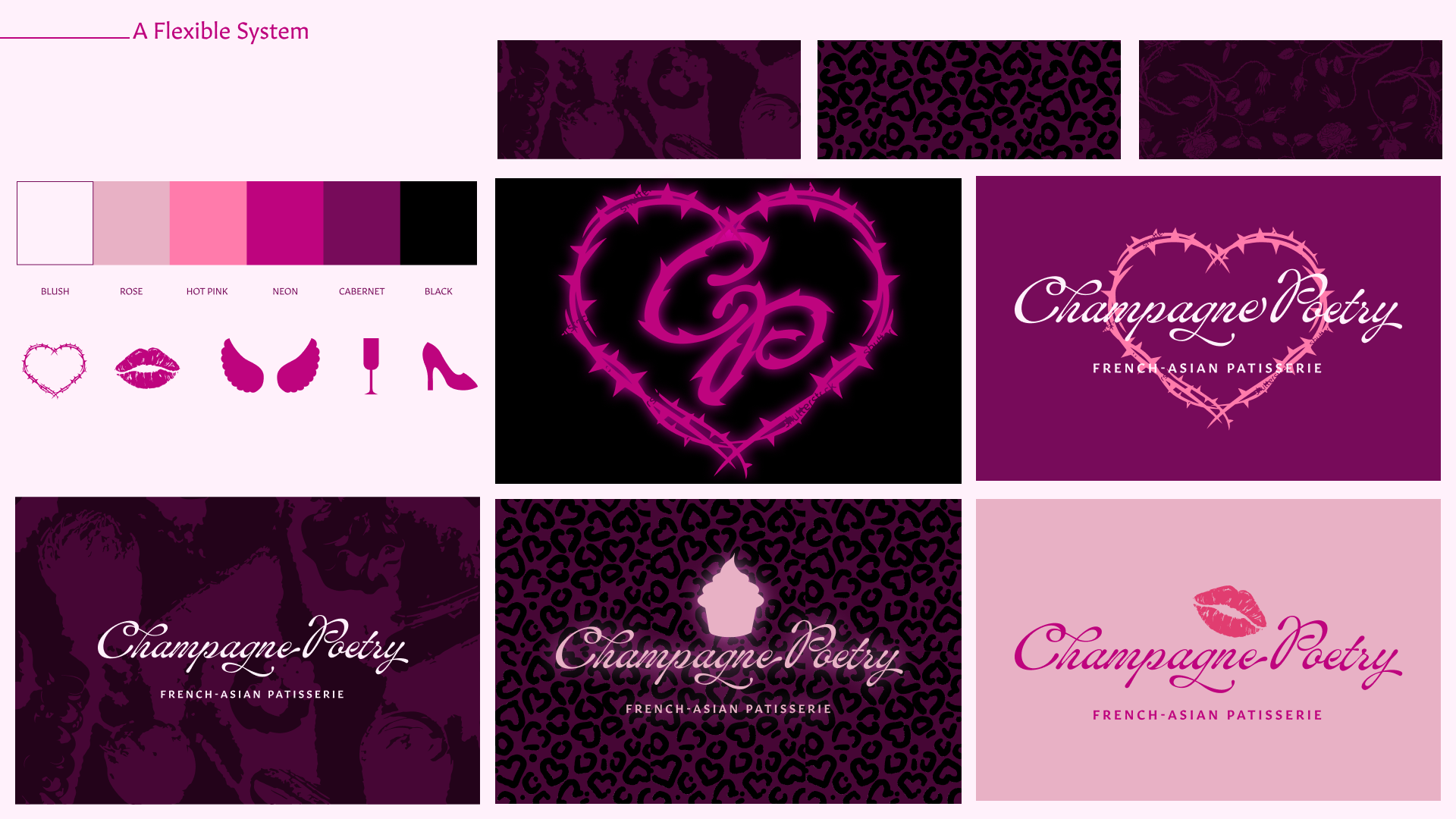
A Flexible Design System
We created a system of elements that can be combined in different formulas to create campaigns with different emotional tones—A light-pink treatment with the lipstick mark could be used for a valentines campaign, while a neon thorny heart on a dark background could be used for a "CP after dark" campaign promoting their new late-night hours.
Deliverables