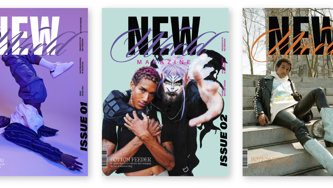
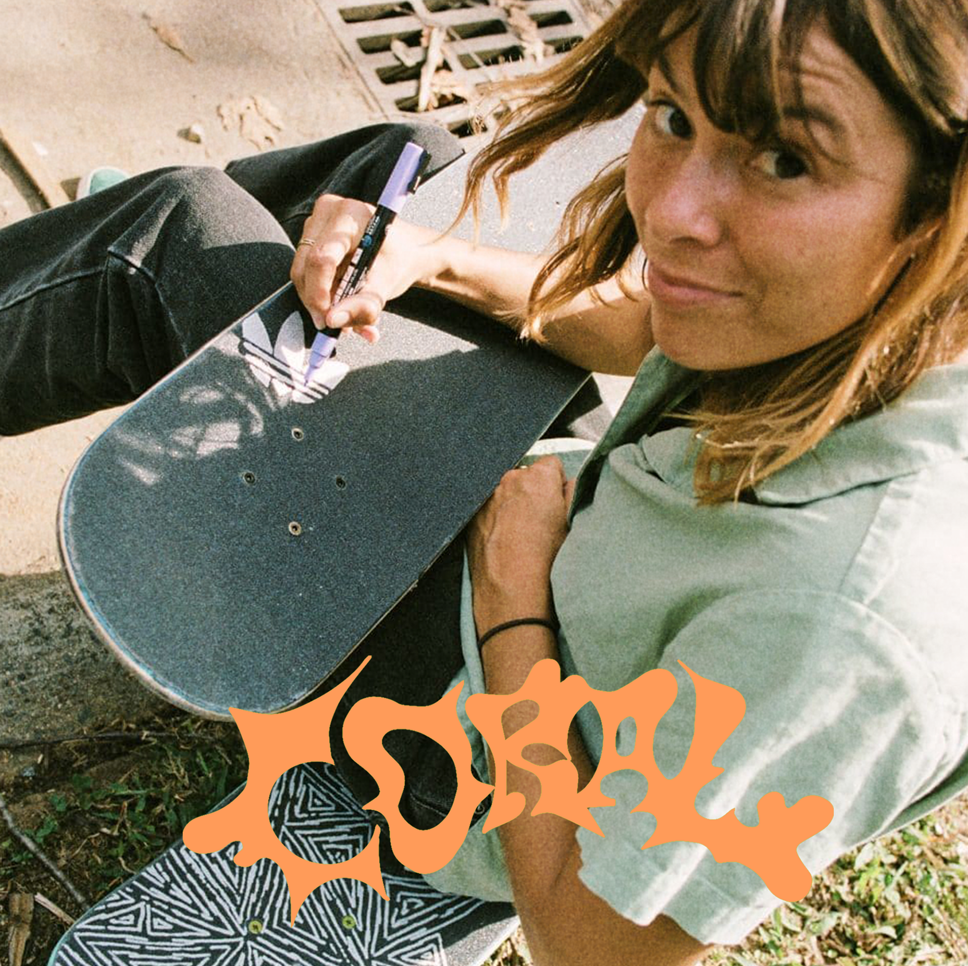
I created an identity and initial product offering for a skateboard brand that honors the diversity and individuality of the skateboarding community.
Concept
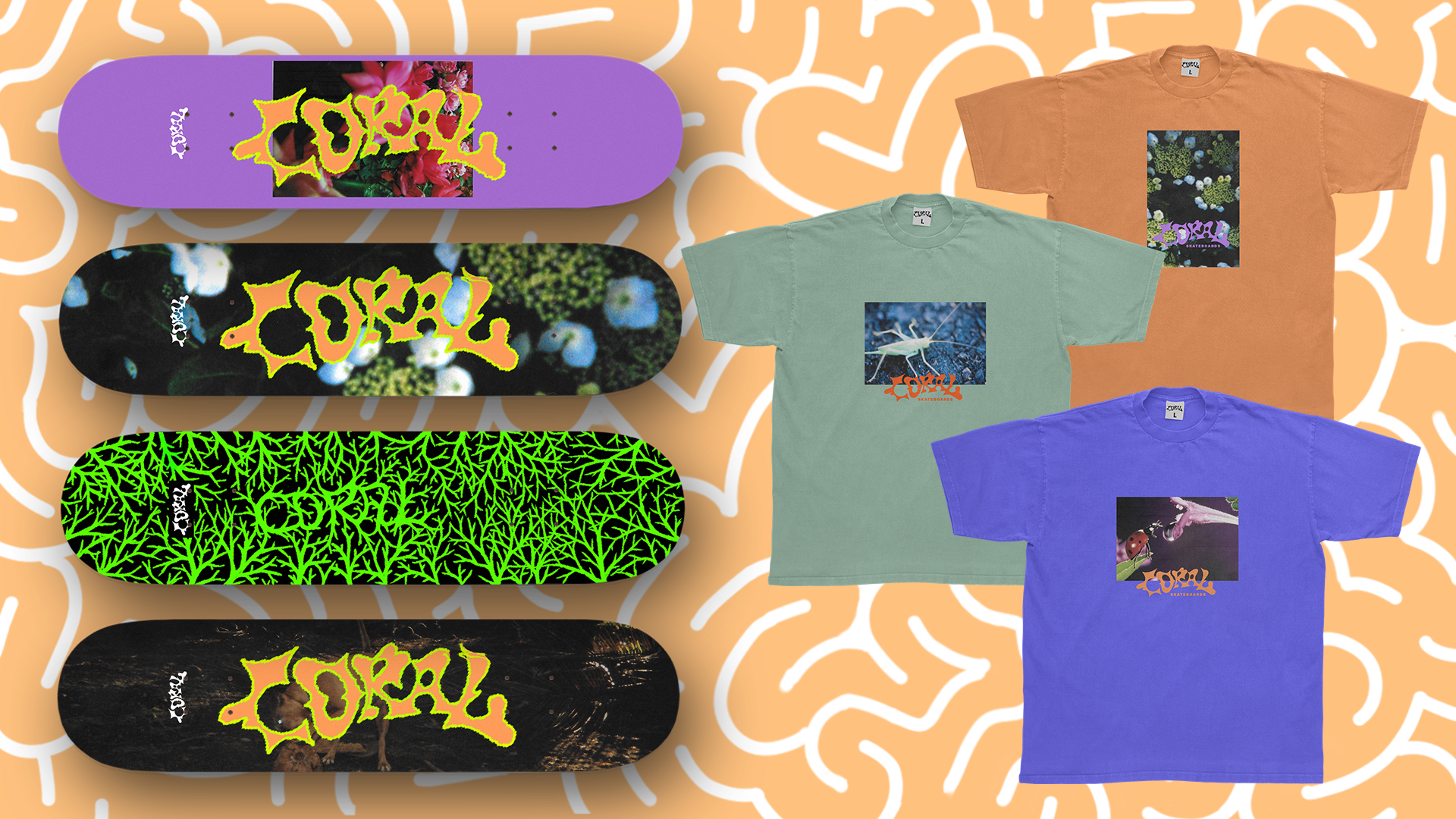
Coral are individual colorful organisms that grow in colonies bringing beauty to the world. Likewise, Coral Skateboards serves a community of diverse individuals that express themselves boldly, yet come together in community with each other to bring beauty to the skateboarding world. Creative expression and inclusivity are at the core of Coral.
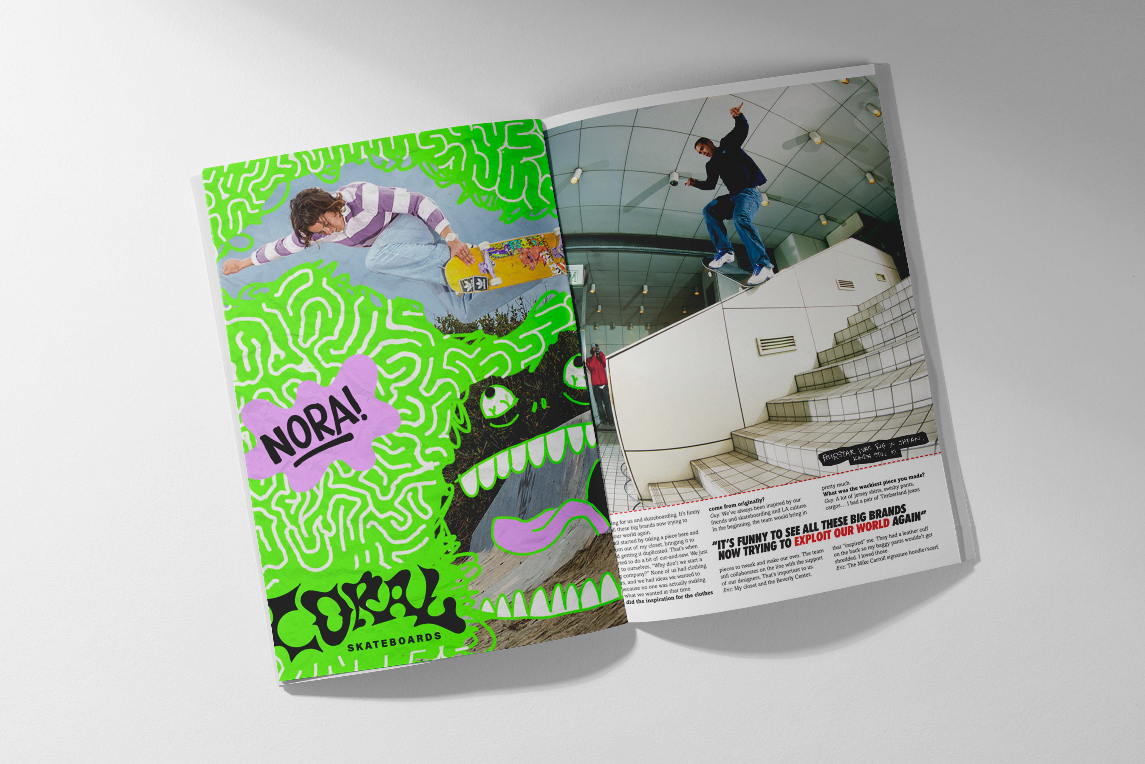
The Team


Target Audience
Coral is for anyone who doesn’t resonate with mainstream skate culture, whether due to toxic masculinity, lack of representation, or simply uninspiring graphics. We are creative and steeped in DIY ethos—we make art, play in bands, dress up, and are unapologetically ourselves.
Goals
Coral aims to create a space that’s inspiring and welcoming to highly creative outcasts of all stripes, and needs a brand identity that communicates it’s core identity while leaving space for the individual t-shirt and board graphics to work as standalone pieces of art.
Strategy
This Brand Identity will:
• communicate the blending of diversity and togetherness, toughness and tenderness, nostalgia and futurism
• appeal to the non-traditional and “alternative” skater with engaging graphics
• feel like skating with your friends and making cool art
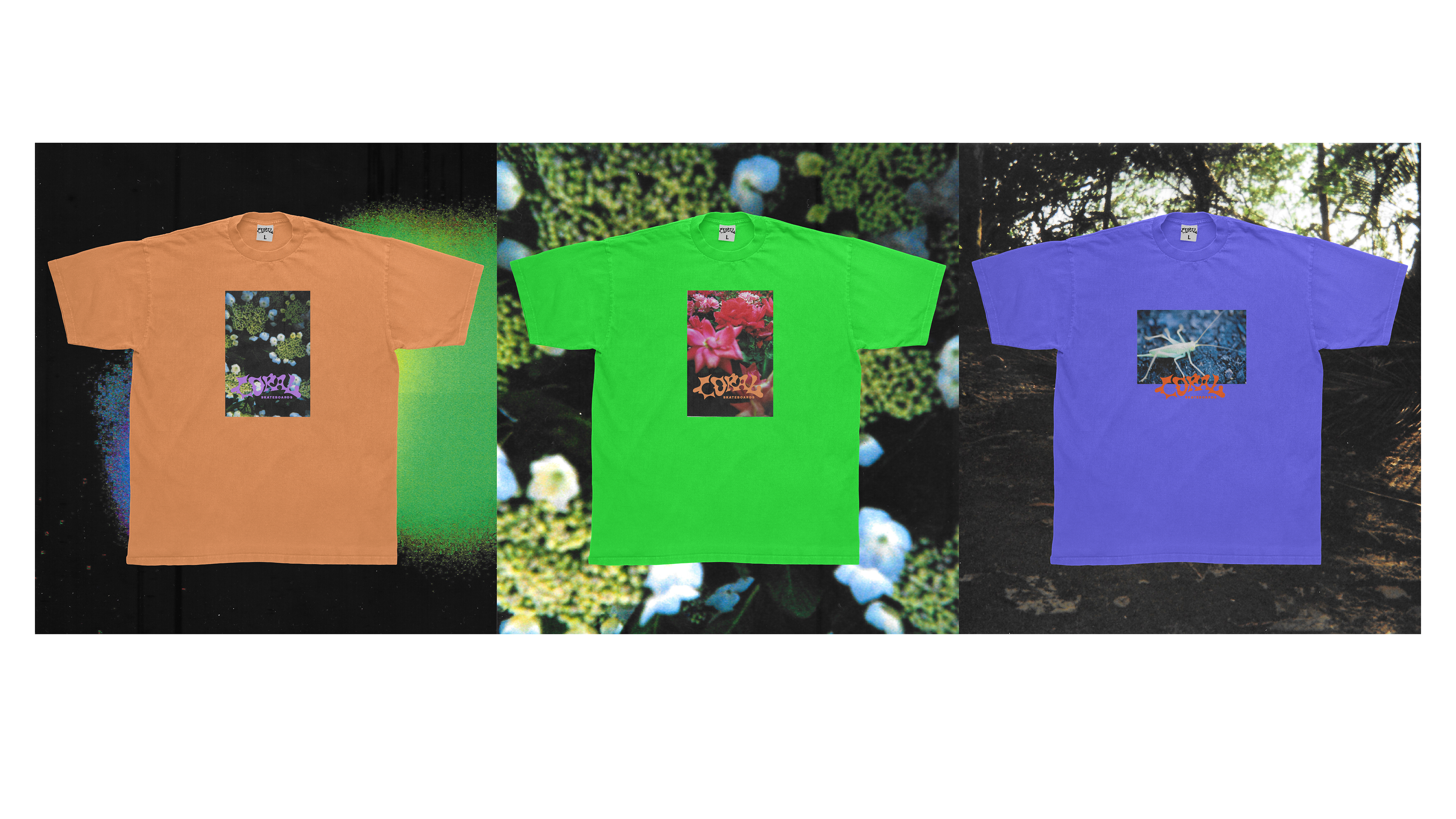
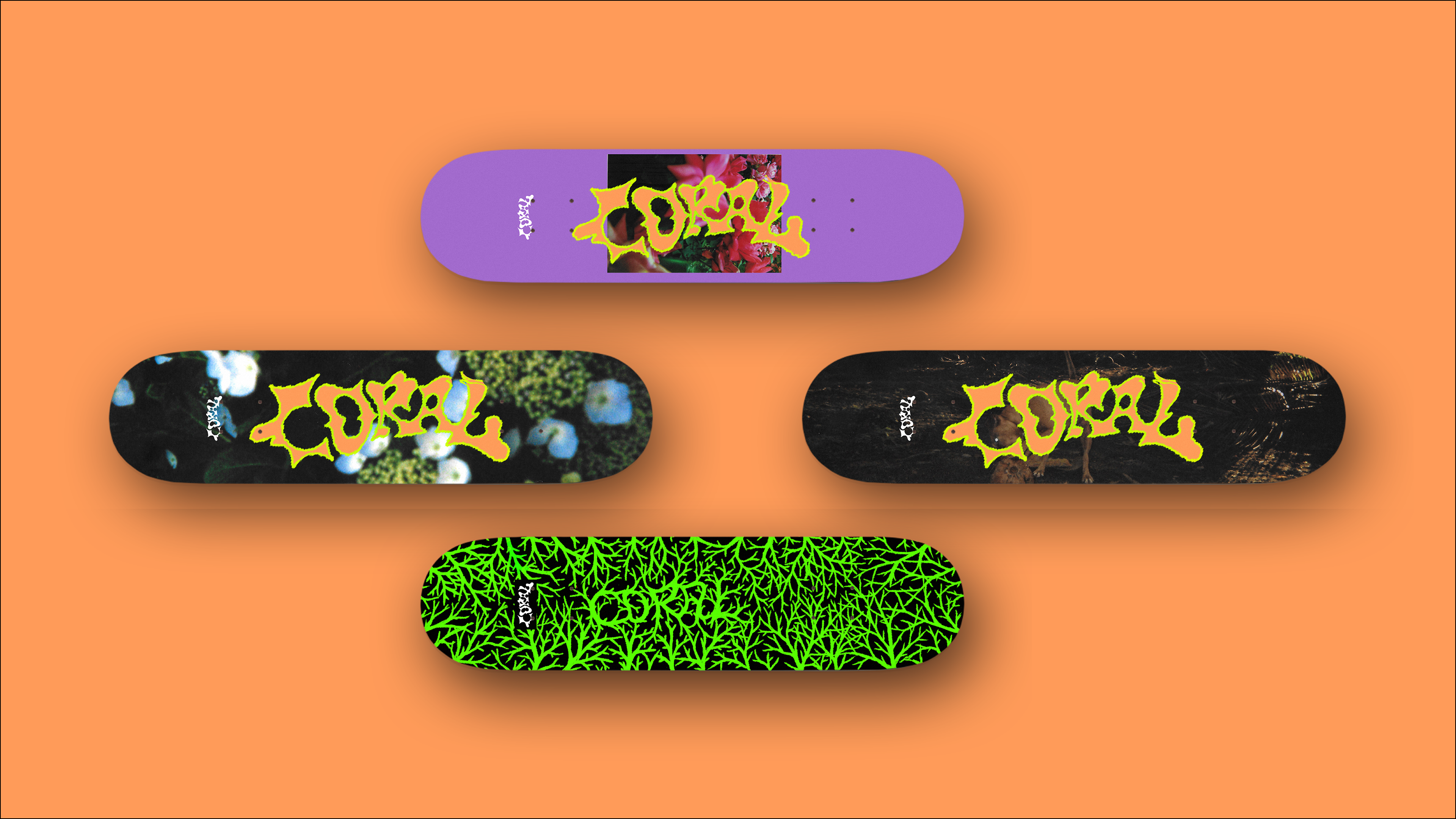
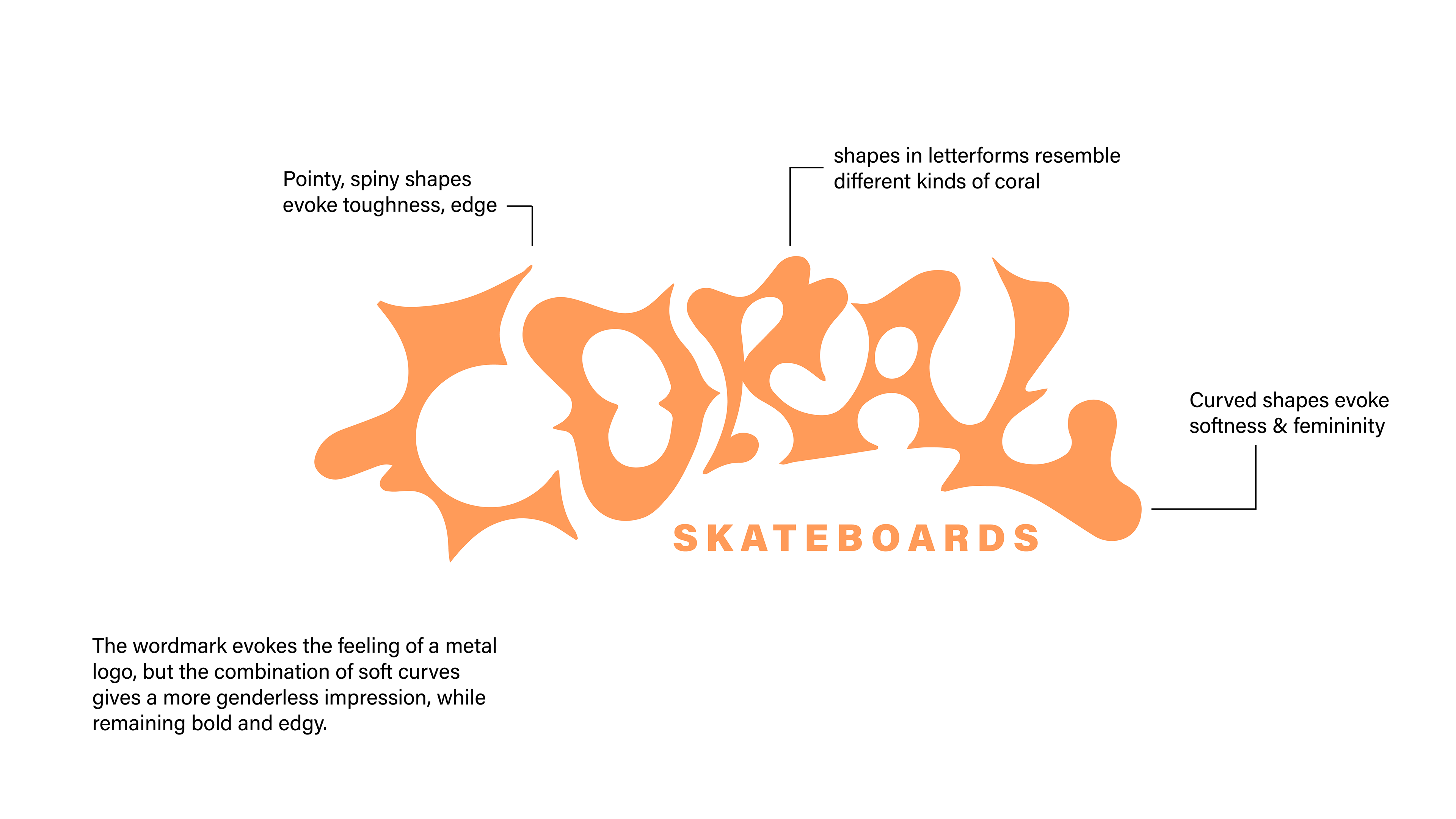
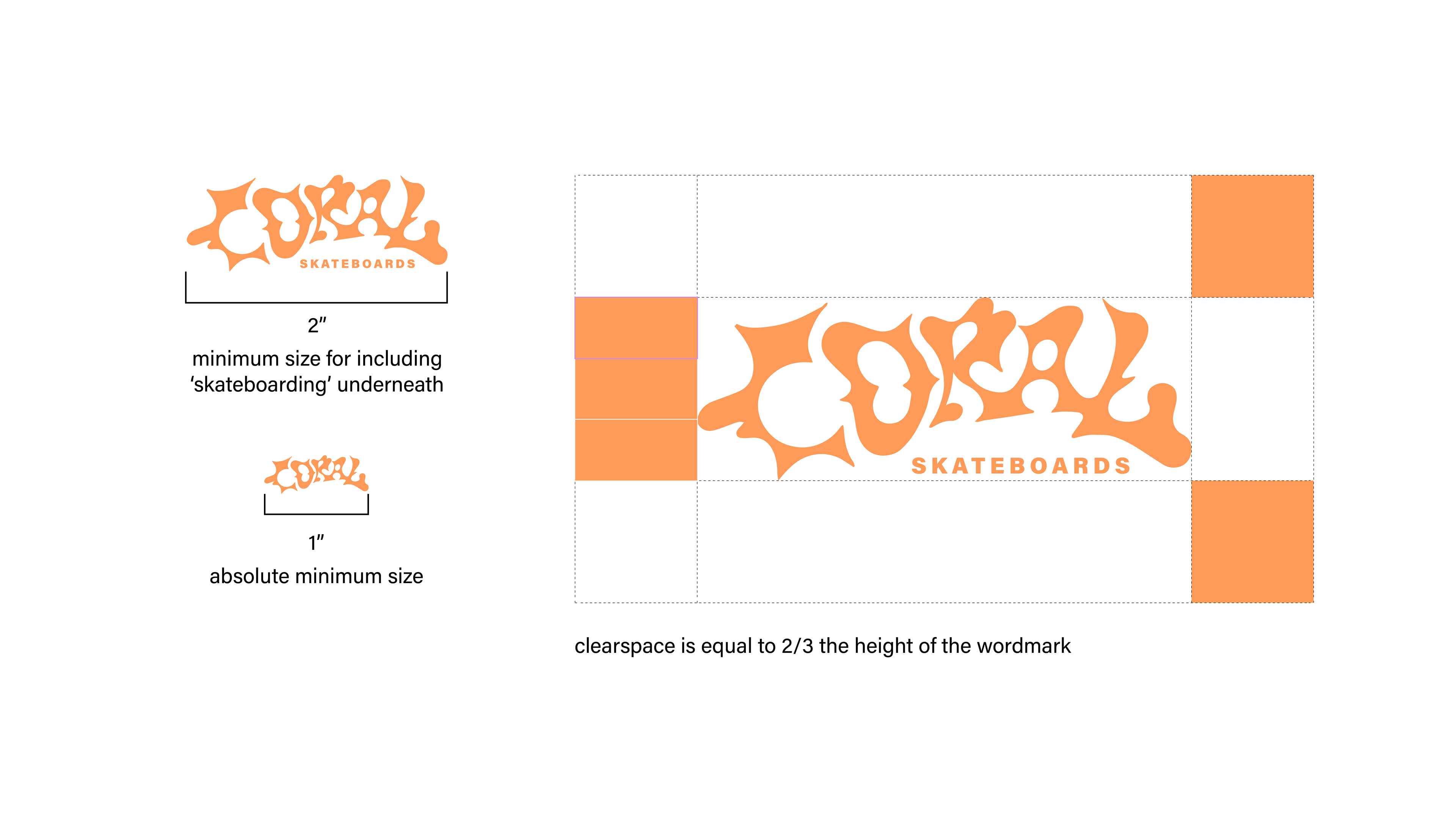
Wordmark
Imagery
Coral draws on two kinds of images for its graphics: images of nature and found images with unknown stories and subjects. Nature is a core source of inspiration as it’s rich with colorful forms of life that often go unnoticed.
Found film photos give a sense of nostalgia: the brand’s visuals should feel like the nostalgia of tomorrow. Images should either be or look like film photographs you might find at Scrap or the Goodwill bins.
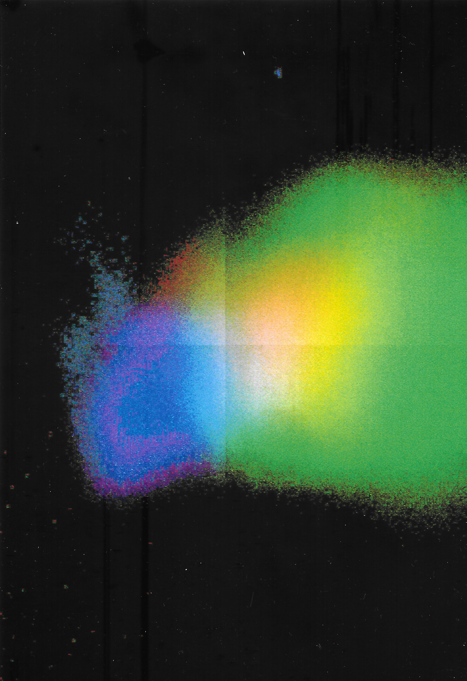
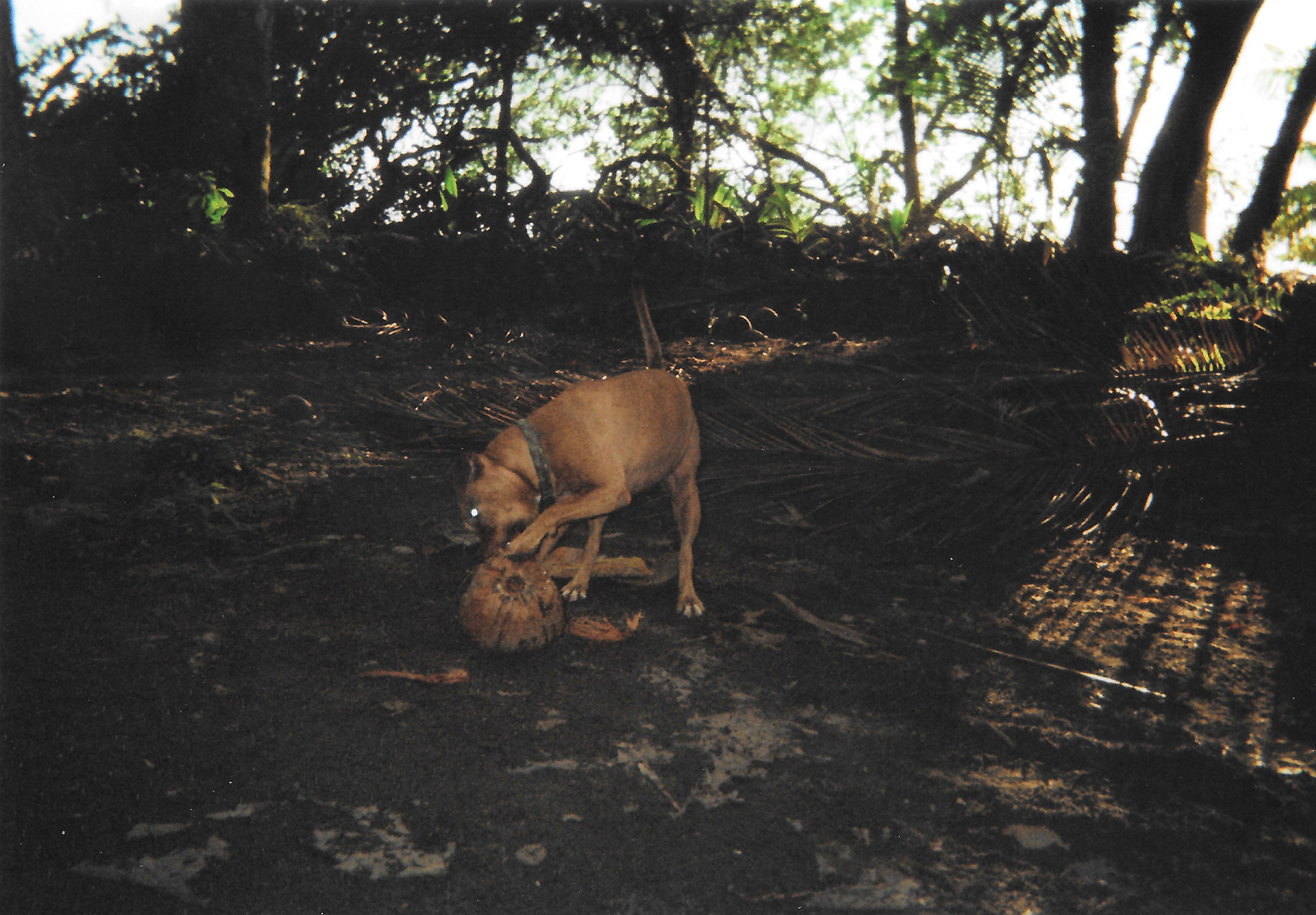
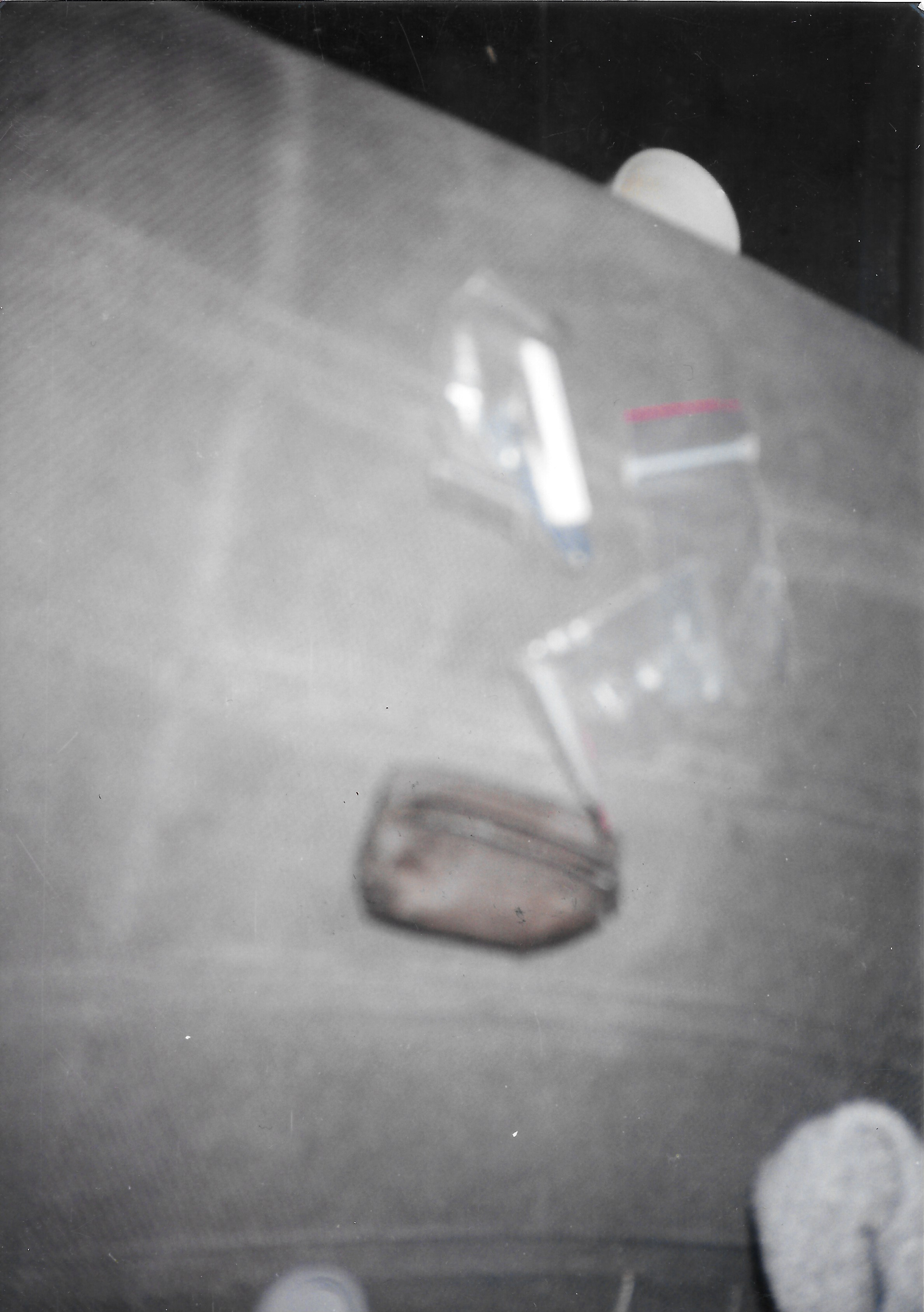
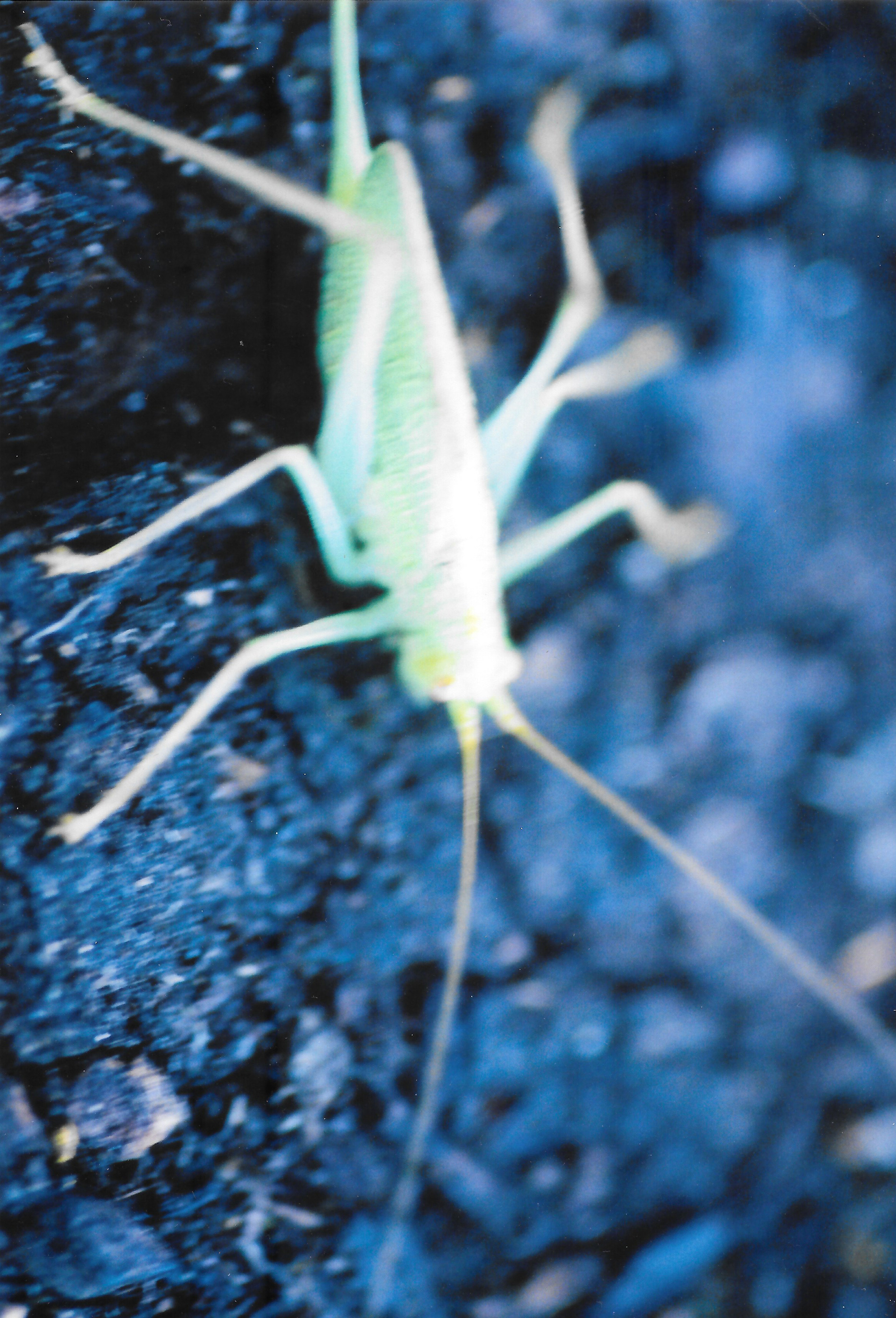
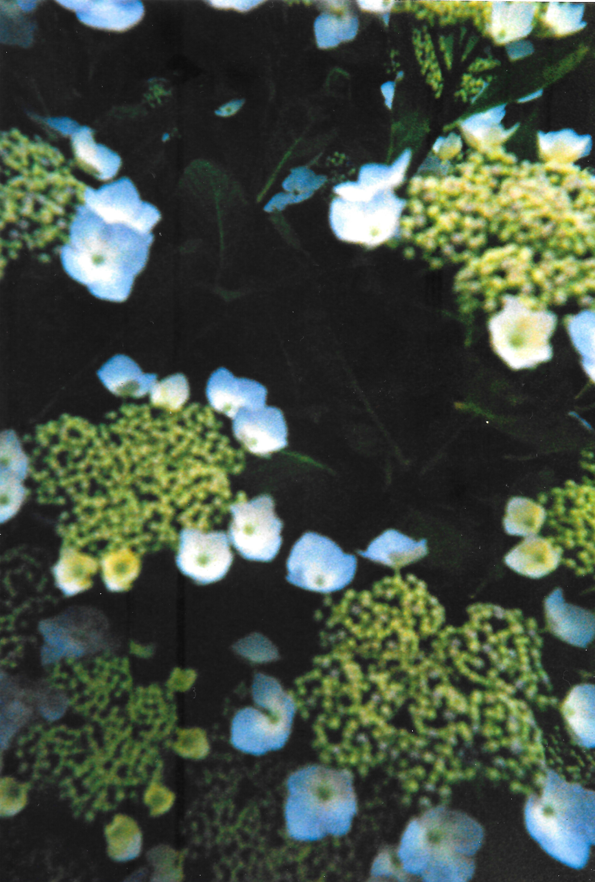
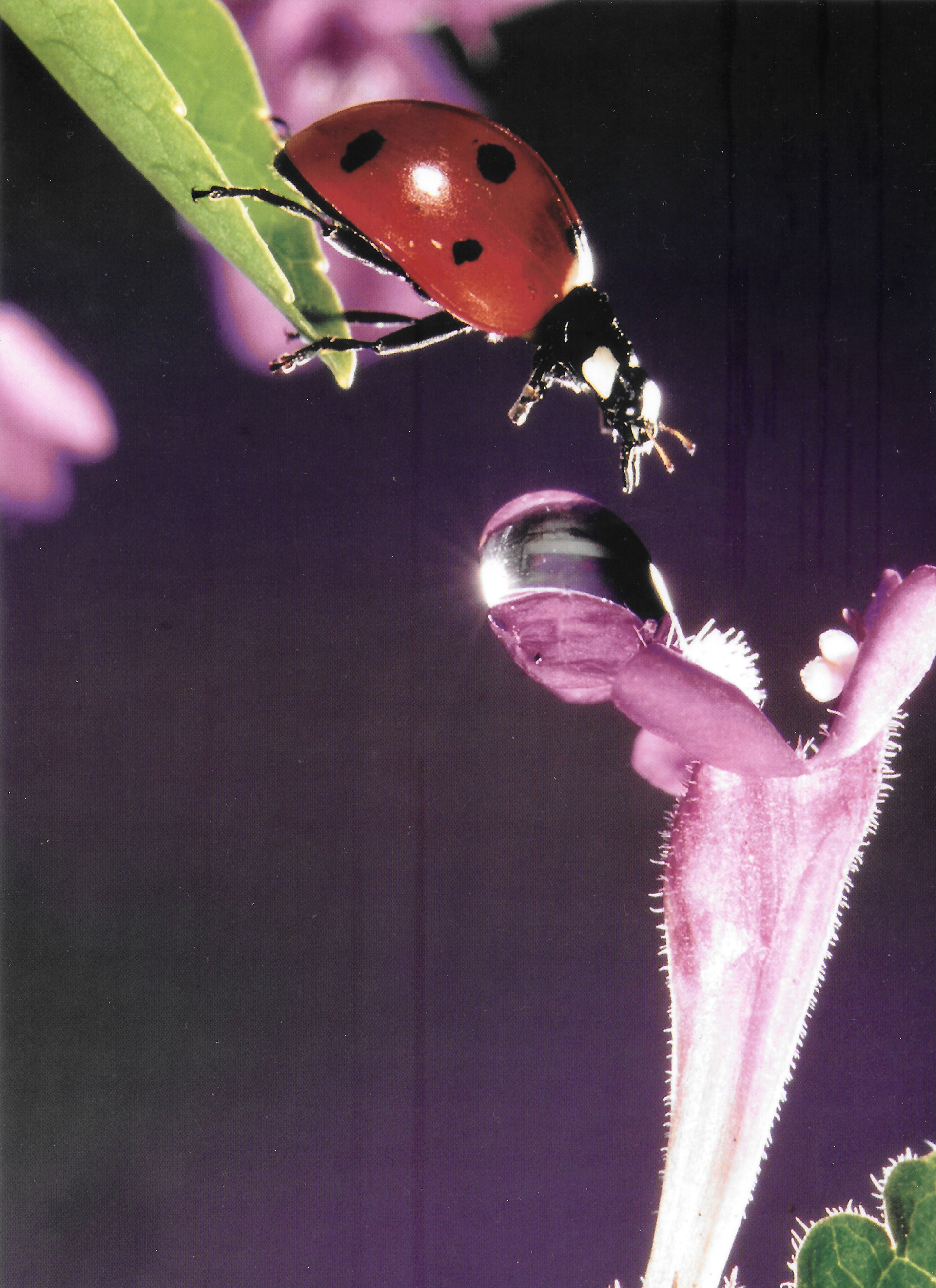
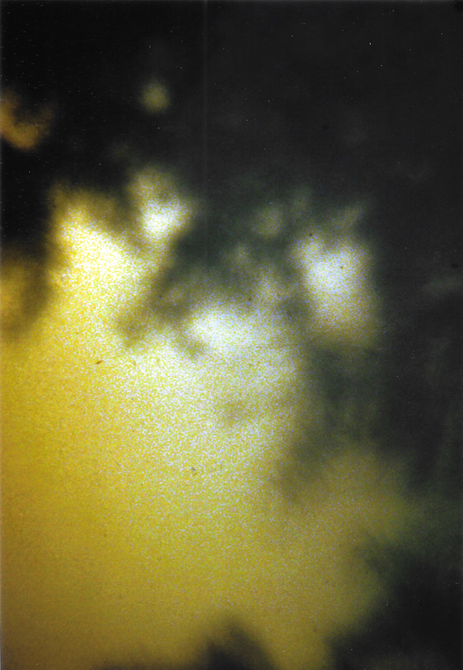
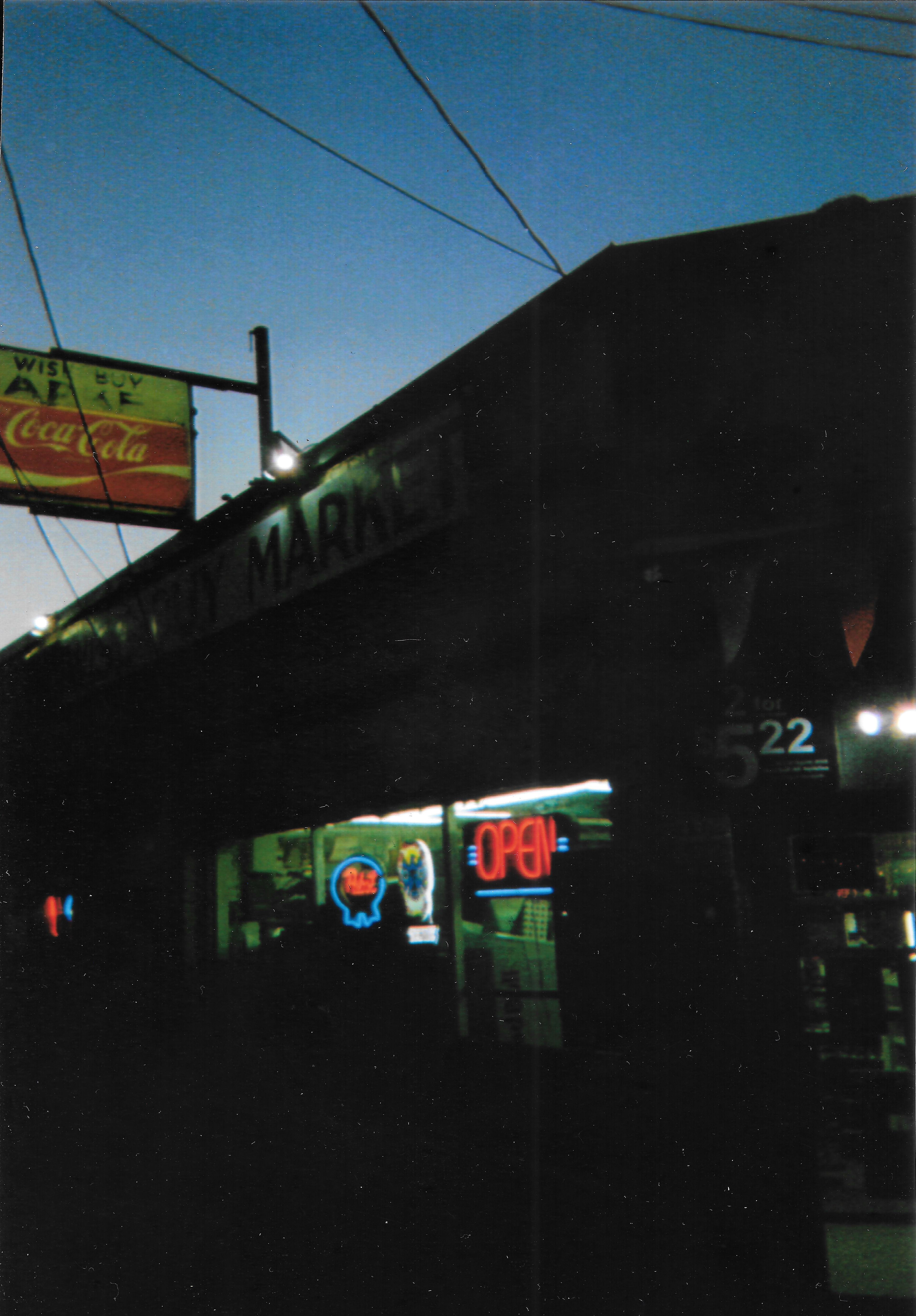

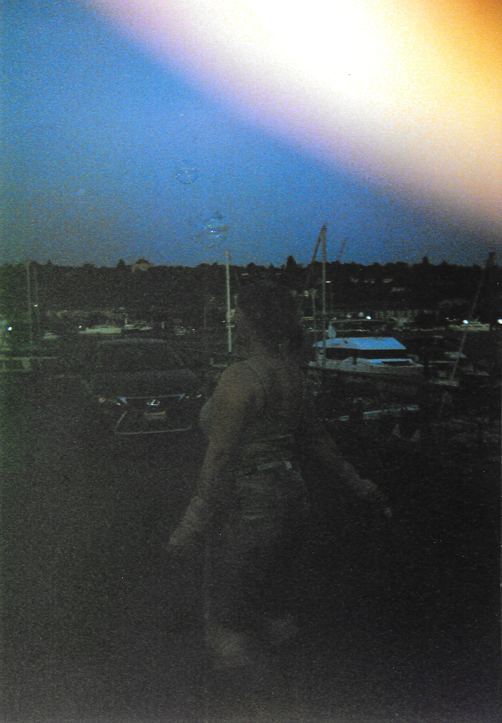
Illustration & Pattern
Patterns are used to evoke bubbly fun or metal vibes, and mimic the shape of coral. Illustration style is playful yet chaotic and grotesque.
Deliverables